Cover illustration for Wieden + Kennedy London's 'Book of the Year 2015'.
Book of the Year is the creative agency's annual publication which charts what W+K got up to over the previous twelve months. Art direction by Freddy Taylor.
Book of the Year
Cover illustration for Wieden + Kennedy London's 'Book of the Year 2015'.
Book of the Year is the creative agency's annual publication which charts what W+K got up to over the previous twelve months. Art direction by Freddy Taylor.
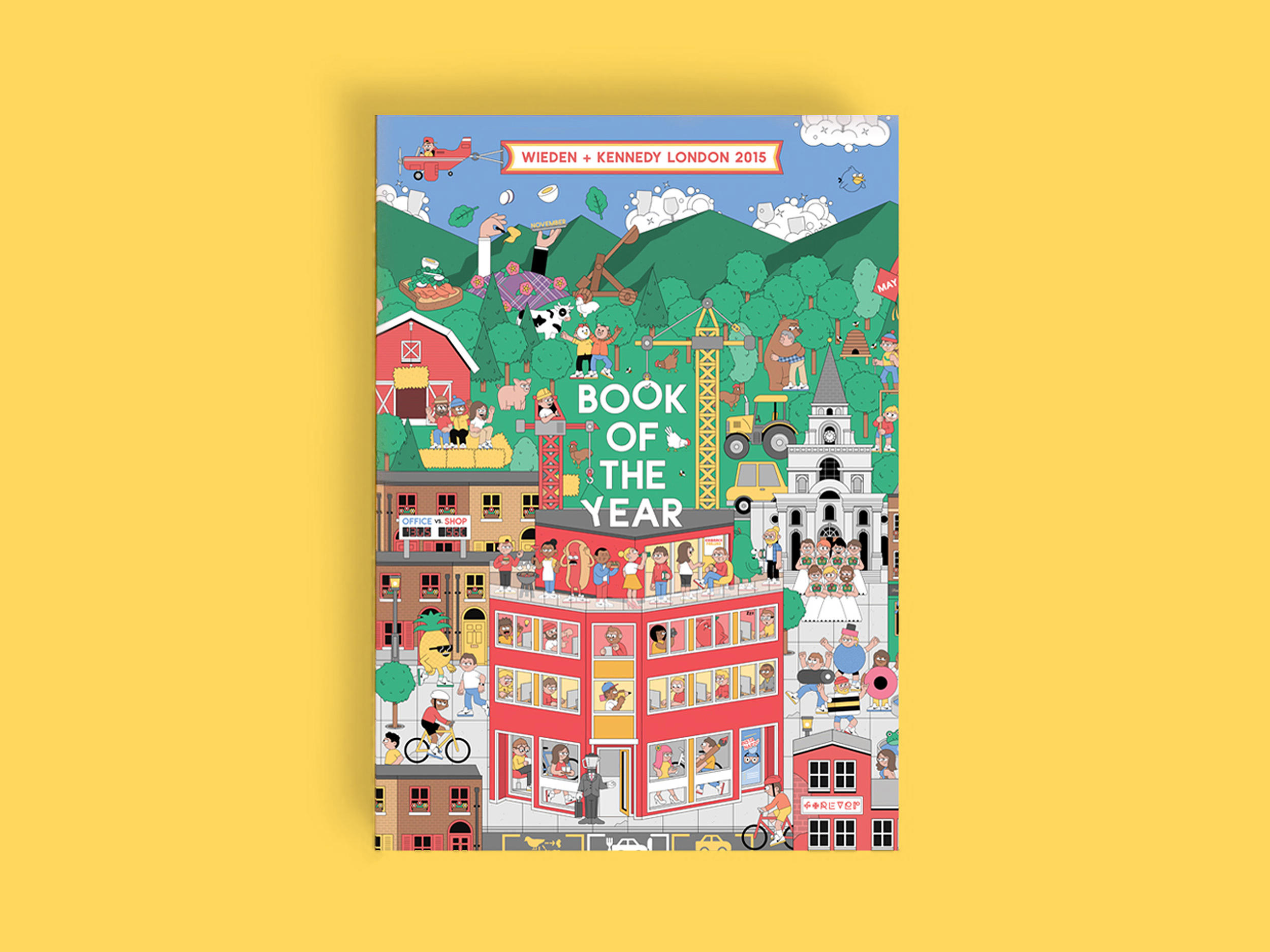
'A window into their world' the publication documents not only the work for their clients - the new business wins, the shoots, the behind the scenes, the work, the awards - but also the culture of the agency with all the fun they have within their four walls in Hanbury Street, E1.
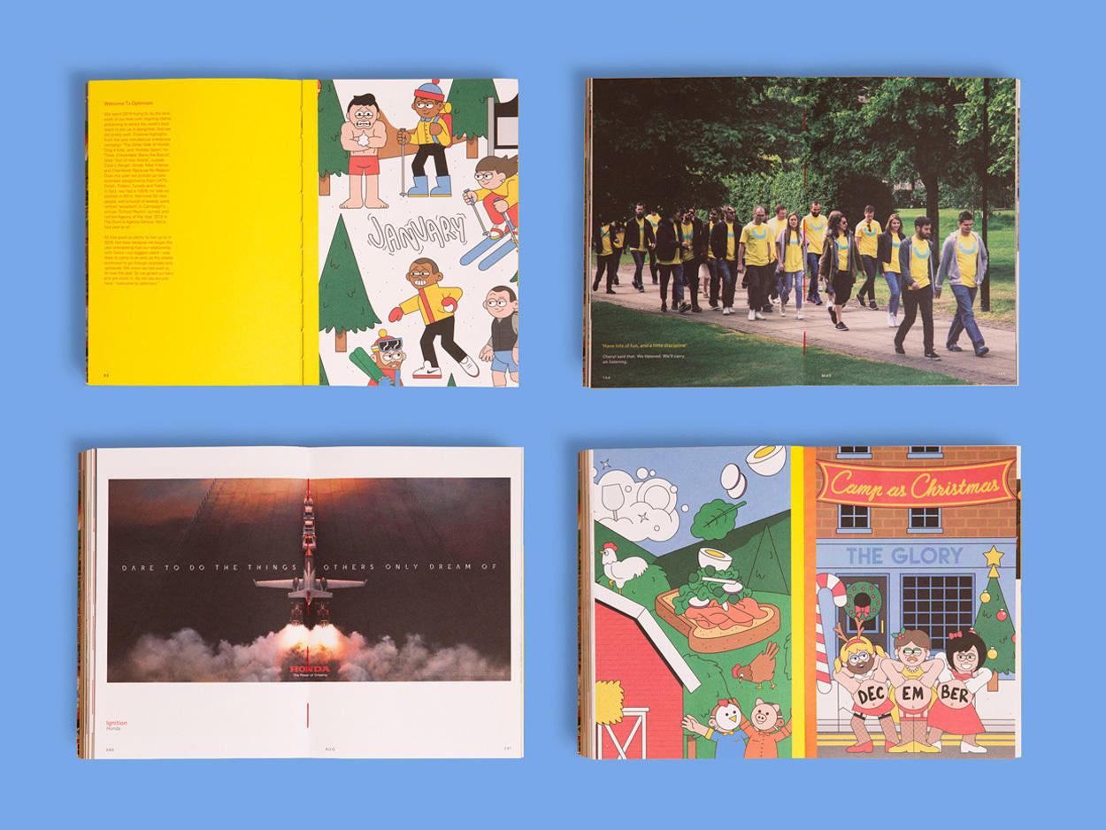
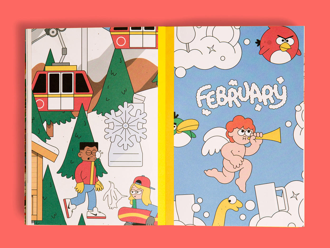
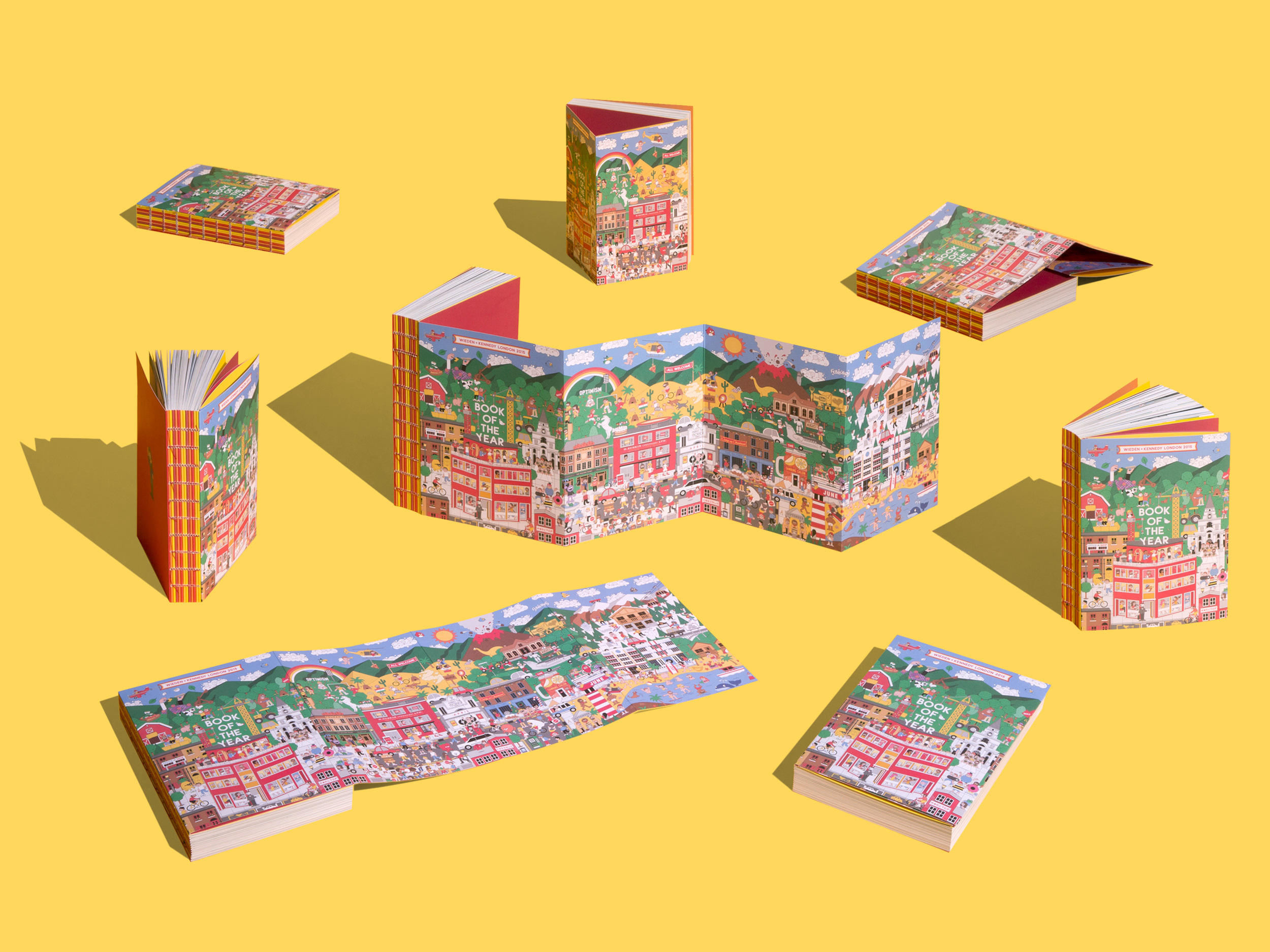
Working closely with W+K I was tasked with creating an illustrated ‘Land’ that incorporated every client, showed off the work, championed their people, highlighted some of year's more notable moments and conveyed one of the core W+K values: Optimism.
The illustration was then used across the 4 page gatefold, front cover with curated crop-ins making up the monthly chapter covers.
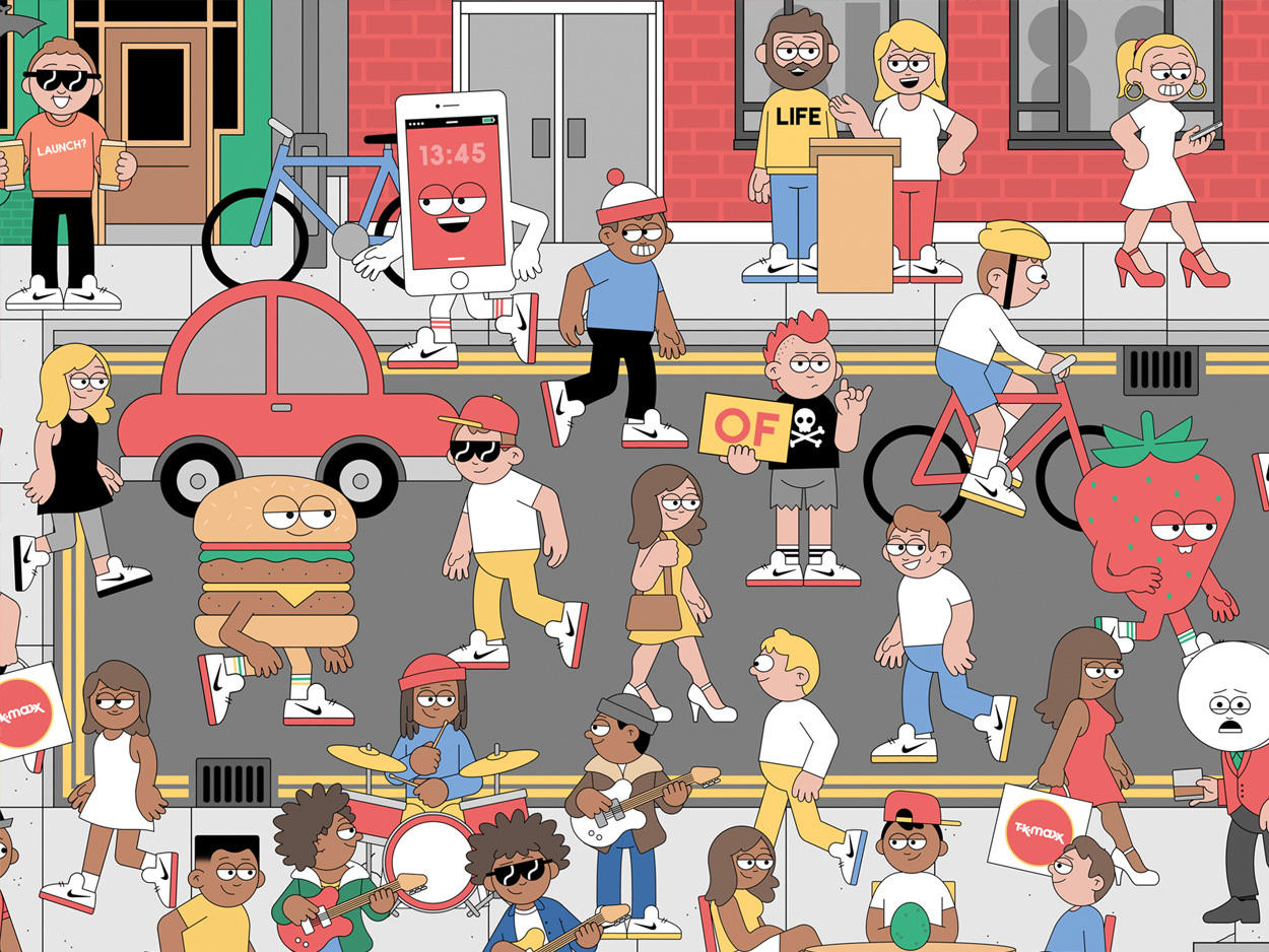
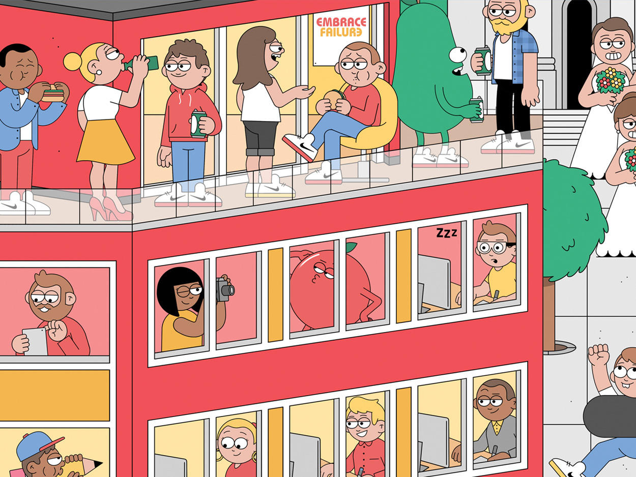
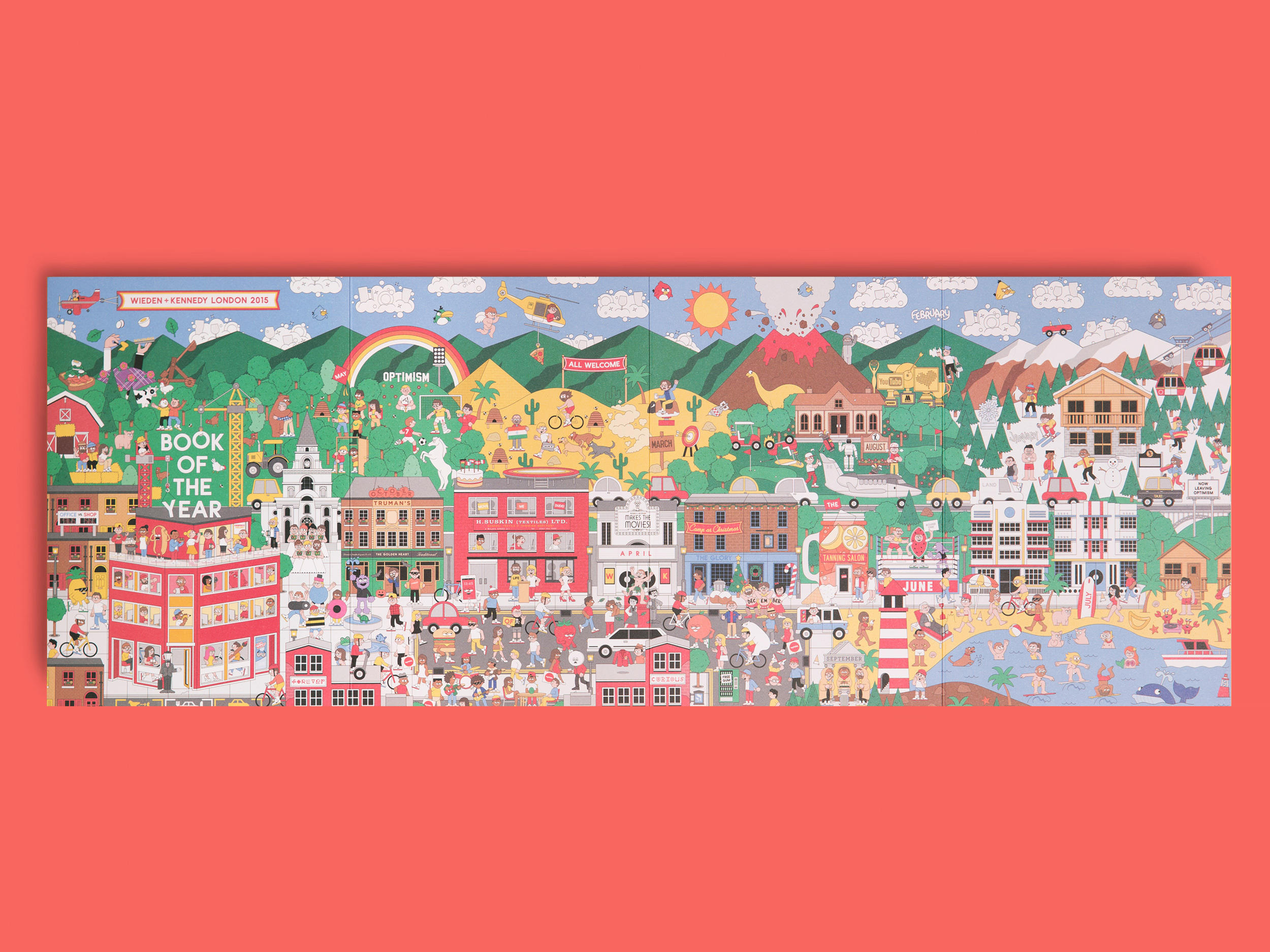
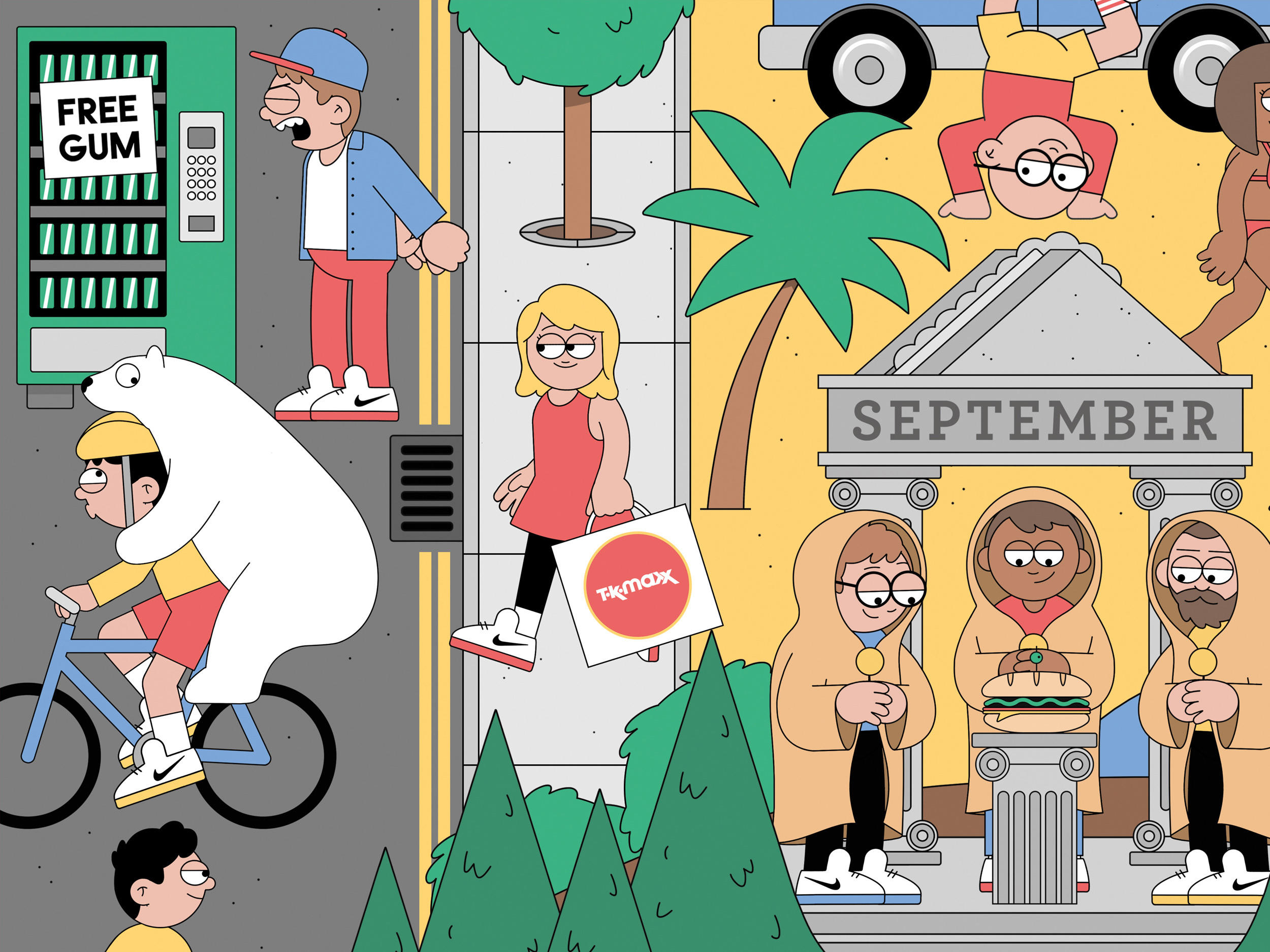
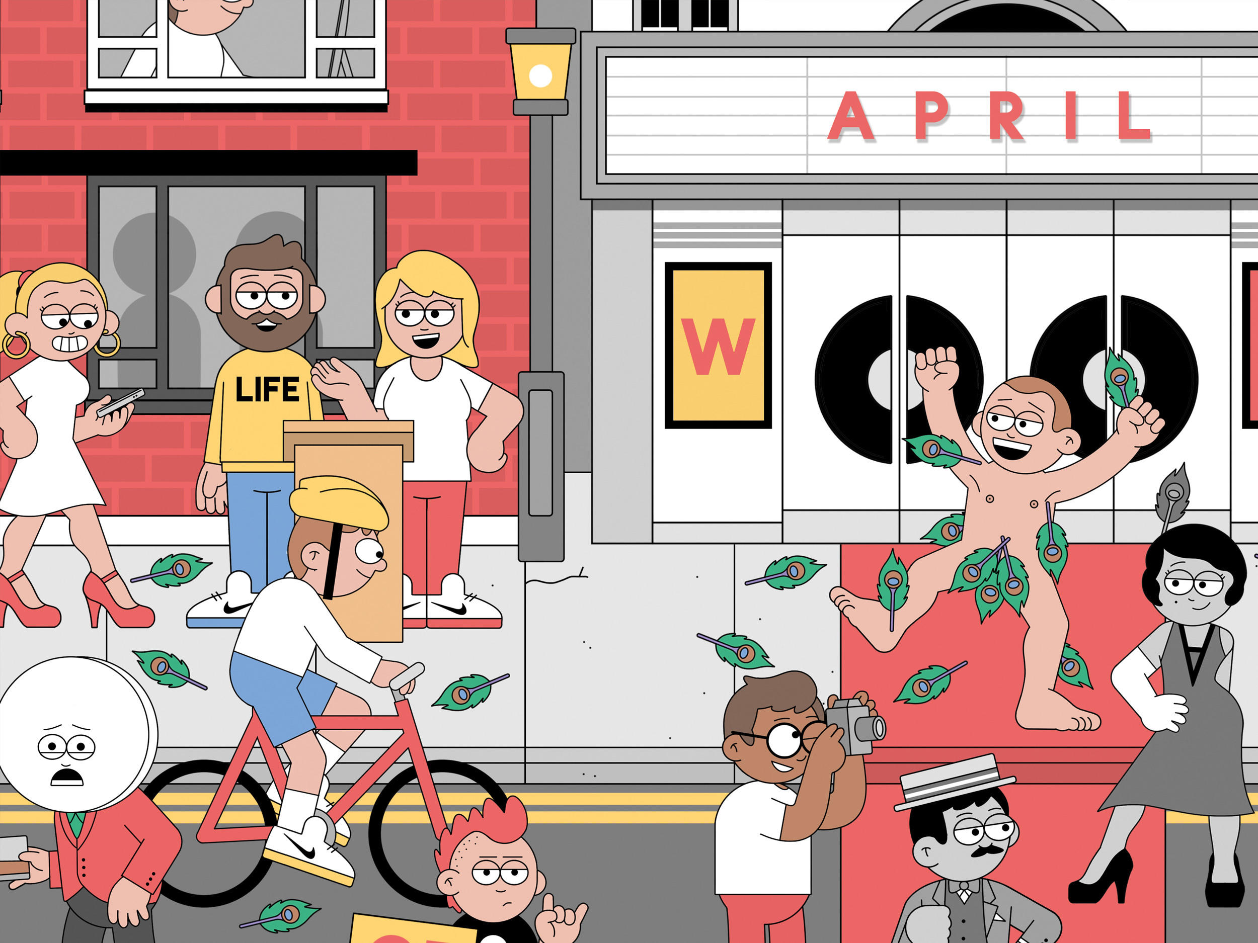
This project was particularly ambitious as an illustrator. Creating a single composition that encompasses several different types of landscape took quite a bit of planning!
The other big challenge was creating an image that could hold detail when zooming in up to 200%!
The solution was to create a totally flexible 'large photoshop document'.
Every single character, building, tree and vehicle you can see here was drawn as a stand alone illustration in a separate file. These individual elements where then placed within the master file as layers and moved into place.
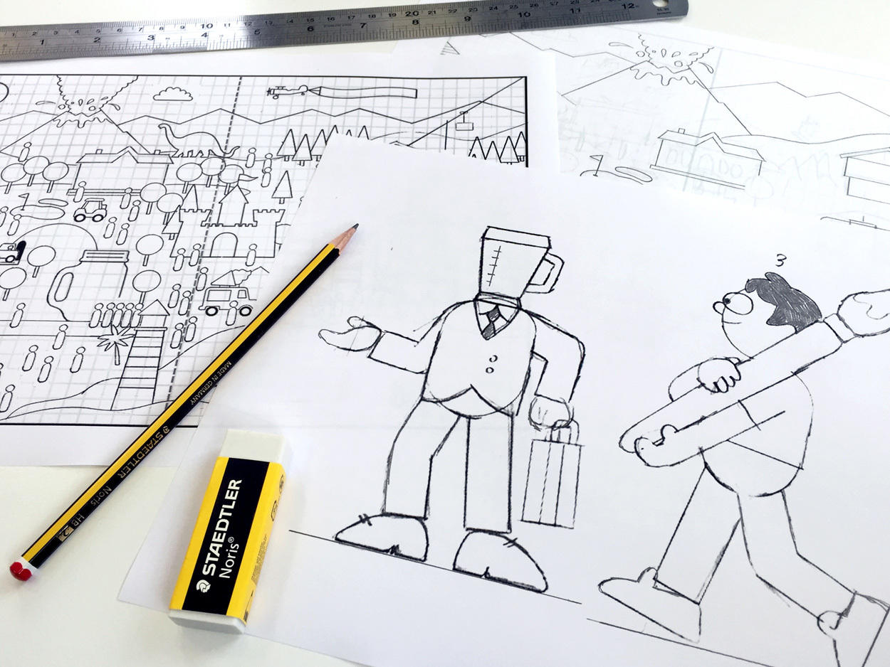
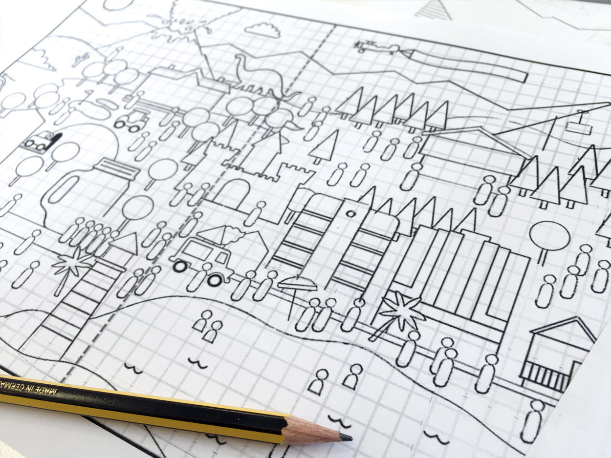
I had a blast working on the project and am extremely pleased with the outcome. I may never understand some of the things I was asked to draw but that’s what made this project all the more enjoyable!